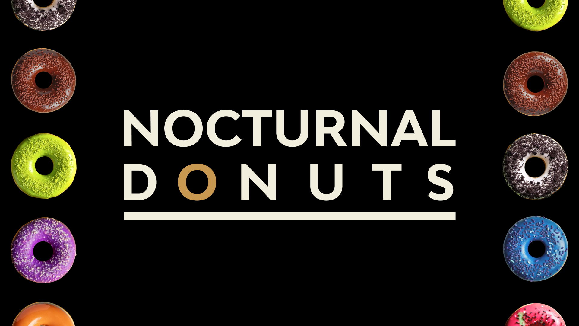
MIDNIGHT MUNCH: DESIGNING THE NOCTURNAL DONUT EXPERIENCE
This kiosk UI was designed for Nocturnal Donuts, a late-night donut shop catering to customers in need of a nighttime pick-me-up. The interface combines corporate styling with functionality, creating a seamless checkout experience tailored to the shop's unique hours and customer base. By balancing sleek design with intuitive features, the kiosk ensures customers can quickly and easily complete purchases during their late-night visits.
SERVICES
UI Design, Kiosk Design
Software
Figma, Adobe Firefly, Adobe Photoshop, Adobe Illustrator
Problem
Late-night workers often want to simply get their food and drinks and get straight to work. Nocturnal Donuts, exclusively serving nighttime workers, required a kiosk design that not only enhances the customer’s experience of the brand but also streamlines the ordering process for maximum efficiency.
SOLUTION
I designed a kiosk UI for Nocturnal Donuts that integrates the concept of night time work hours while prioritizing ease of use for late-night customers. By focusing on intuitive navigation and clear visuals, I ensured that users can efficiently place orders and promptly enjoy the shop’s freshly made donuts and energizing coffee with minal contact with any in-customer service.
Creating a user flow was essential for understanding how late-night city workers navigate the kiosk to quickly order their coffee and donuts. By mapping each step, it identified potential challenges and streamlined the interface to ensure a fast, efficient, and satisfying experience for busy nighttime customers.
MIdnight User Flow

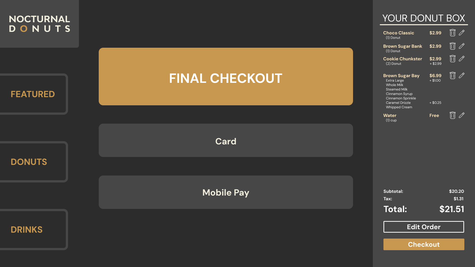
The kiosk was inspired by the concept of a classic rectangular donut box, hence the horizontal design. Most restaurants that implement kiosks opt for vertical models. By contrast, this horizontal design distinguishes the experience, setting it apart from the competition.
Kiosk Development


Wirerames
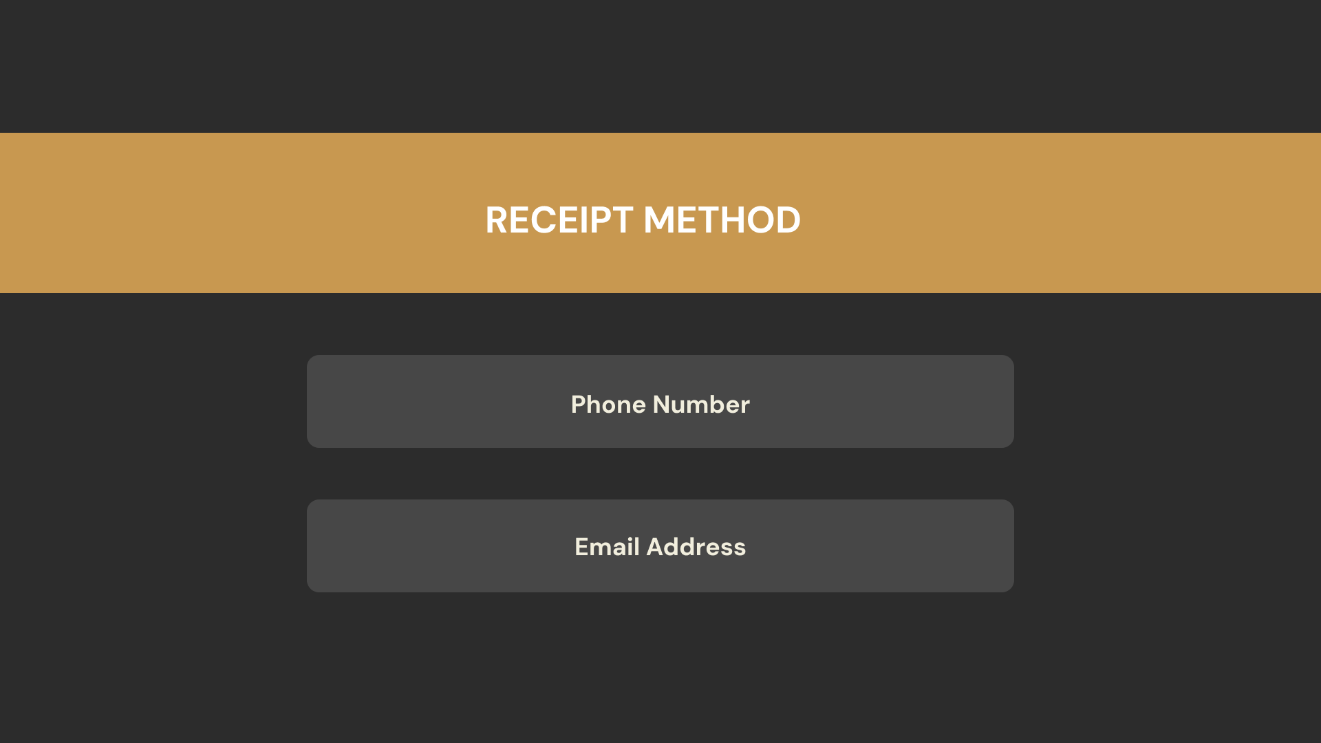
There were only a few wireframes, as most screens were simple variations based on the user’s choices. I shifted from larger graphics to simpler, minimalist designs for transaction screens to maintain a sense of confidentiality and seriousness.


Final Kiosk Screens


Artificially Generated Donuts
Due to a lack of a proper product photography and physical donuts, I had to create realistic looking images quickly and efficiently. Although Adobe Firefly has its limitations, the donuts and coffee cup generated by the software were decent enough to serve as generic objects along with Photoshop being able to extract donut for further application around the design.


Takeaways
The kiosk design had a user friendly experience that allowed customers to order efficiently. The customer is shown a clear break down of information especially the customization screens for the drinks. Prioritizing the customer’s needs were met through engaging visuals and a minimalistic approach.